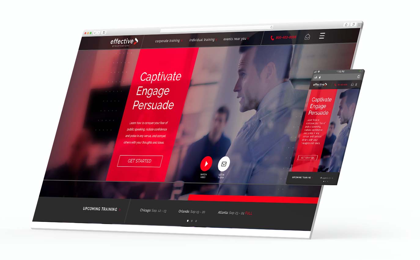
The Challenge
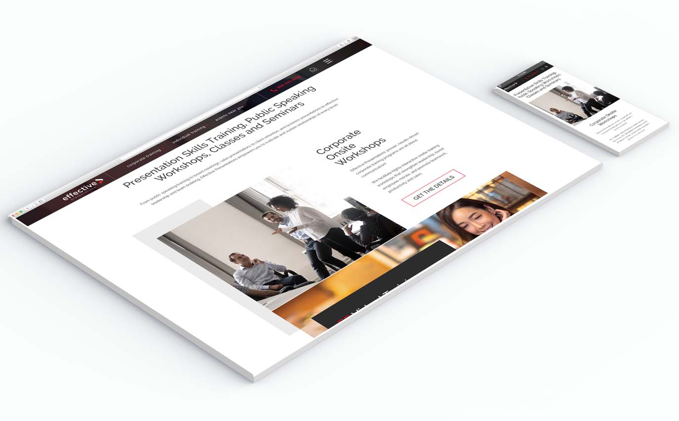
We worked with Effective Presentations to create a new brand and responsive website that would match their strong SEO with a look that was more intuitive and engaging. We also needed to create a look that was as strong a s B2B lead generator, as a B2C lead generator.
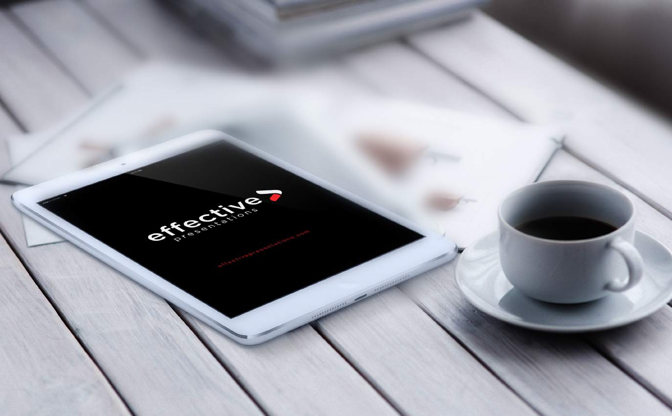
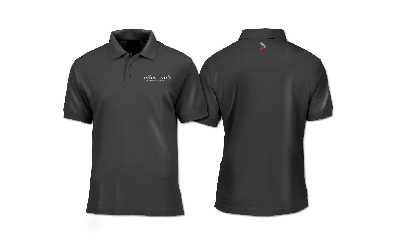
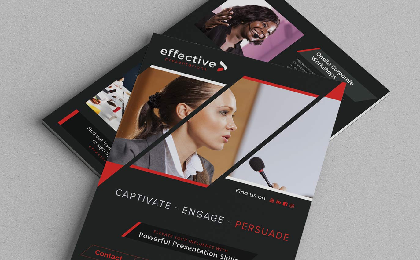
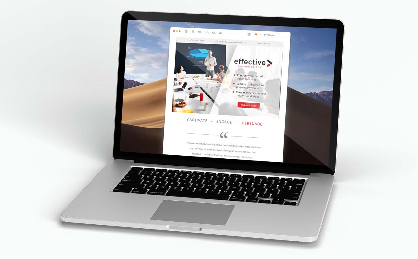
The Solution
We created a brand redesign that is about moving forward. Becoming a better speaker/presenter is all about personal improvement and growth. The icon at the end of the wordmark creates a look of forward-motion. This strong look is continued through the web design, and red is used strategically to guide the user’s attention toward action.